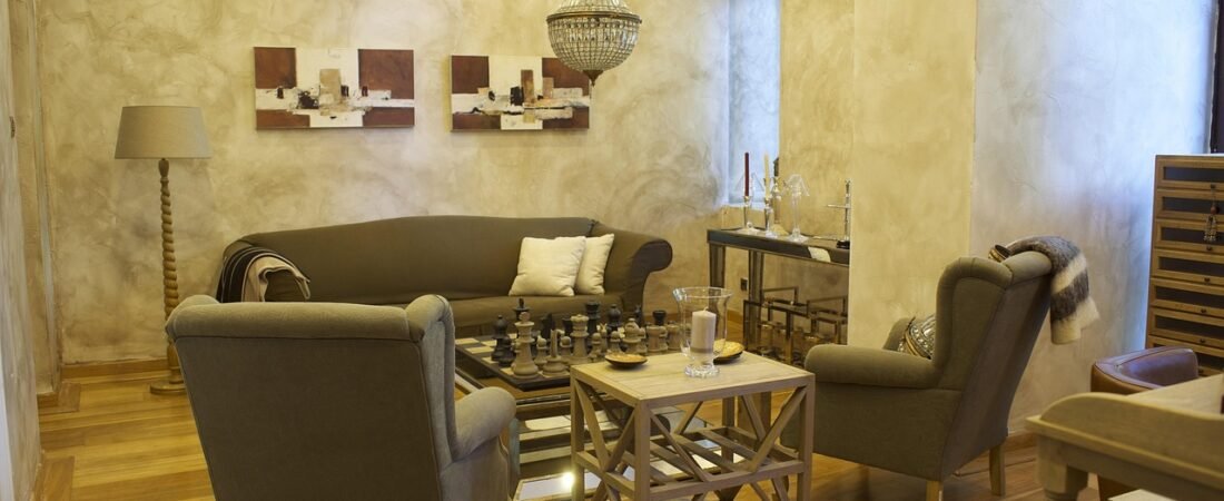
When I redid my living room two years ago, I did what everyone told me to do: matching sofa, matching armchairs, matching side tables, all in the same neutral fabric, all from the same collection page. It looked finished. It also looked like nobody actually lived there — like a hotel lobby that happened to have my mail on the console table. It took a friend, a decorator by trade, pointing at my “matching” set and half-joking, “did you buy this in one click?” for me to notice how flat it all felt.
That’s the shift showing up across 2026’s real trend forecasts: less about a single hero color or one statement wall, and more about mixing textures, shapes, and pieces that don’t all come from the same box. Below are seven specific looks — sourced from actual designers, not generic advice — worth knowing before your next round of shopping or reupholstering.
1. Decadent Fabrics Replace the Matching Set
The move away from matched furniture sets is showing up first in fabric. Interior designer Ellie Christopher describes it directly: “This fall, I’m seeing a return to rich, luxurious fabrics like moiré, silk, mohair, and silk velvet,” she told Homes & Gardens. The idea isn’t to swap one neutral boucle for another — it’s to put a few different rich textures in the same room on purpose: a moiré cushion next to a mohair throw, a velvet headboard against linen curtains. Rooms built this way read as collected over time, not shopped in a single afternoon, which is exactly the point.
2. Funky Ceramics Do the Personality Work
Ceramics have moved from “nice bowl on the coffee table” to an actual design decision. As Homes & Gardens style editor Julia Demer puts it, “Ceramics are one of the easiest ways to introduce personality into a room.” That’s playing out as lumpy, hand-formed vases, glazed in uneven color, displayed in a loose cluster rather than a single matched pair — the opposite of the smooth, symmetrical ceramic sets that have filled shelves for the last decade. It’s a low-cost, low-commitment way to bring in the same handmade, one-of-one feeling that decadent fabrics bring to upholstery.

3. Statement Stone Moves Past the Kitchen
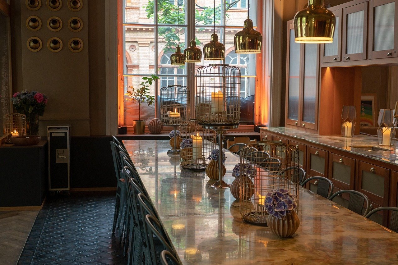
Dramatic natural stone has been a kitchen-counter trend for a few years, but 2026 is the year it leaves the kitchen. “Dramatic natural stone is the biggest kitchen countertop trend in 2026,” says Laura Williams of Living Oak Interior Design — and designer Hillary Cohen of HCO Interiors adds that “statement stones remain a major design player, with heavily veined and richly colored marble moving beyond kitchens and baths.” That means a slab of bold marble or travertine showing up as a console table top, a fireplace surround, or even a headboard wall, treated less like a practical surface and more like art.
4. Double Dressed Windows, Finally Given a Name
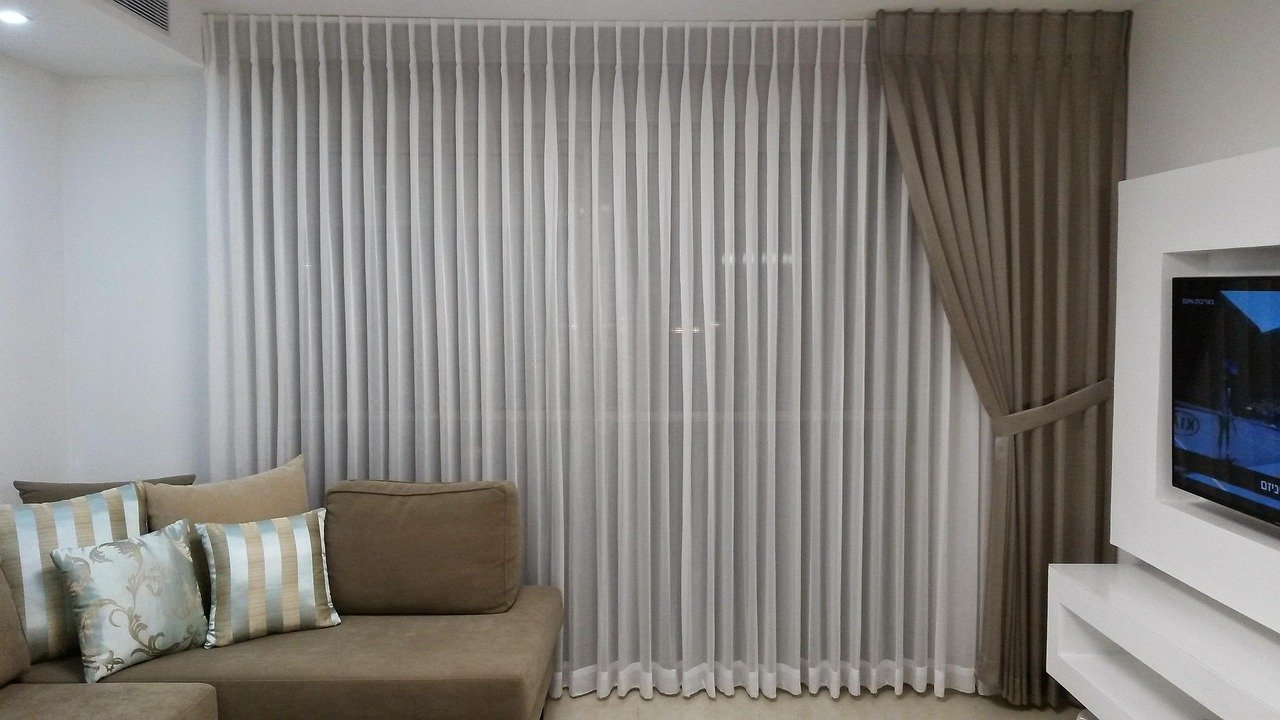
Layering a sheer panel under a heavier drape isn’t new — designers have quietly done it for years. What’s new is that it now has a name and is being called out as a defining 2026 look. “I didn’t even realize double-dressed windows had become a ‘trend’ because we’ve been layering window treatments for years,” says designer Amy Peltier. Fellow designer Bethany Adams goes further: “Ideally, all windows should be double-dressed.” The appeal is practical as much as visual — a sheer layer for daytime privacy and light control, a heavier drape for evening warmth and a finished, tailored look.
5. Game Tables Come Out of Hiding
Furniture built around actually sitting down together is having a moment. “Game tables are finally out of hiding for fall 2026,” says John Maloney McNamara of the design studio Coosa. Instead of a folding card table pulled out only for holidays, that means a proper round or octagonal table — often felt-topped, sometimes with a reversible surface — kept out permanently in a den, a bay window, or an underused corner, functioning as much as a design piece as a place to play cards or work a puzzle.
6. Purple Accents Break a Long-Standing “Hard Pass”
Purple has had a harder time than almost any other color getting back into rotation, and even the designers using it now admit that. “Purple was a hard pass in our studio for years: a color that’s supposed to signal royalty,” John Maloney McNamara says of his own studio’s past stance on the shade. The purple showing up in 2026 isn’t the cool lavender of a few seasons back — it leans deeper and dustier: plum, aubergine, damson. It’s being used the way past seasons used forest green or navy: on a door, a sofa, or one accent chair, not an entire room.
7. Vintage Layers Replace Mass-Produced Basics
The vintage impulse showing up in 2026 isn’t a full room done in one era — it’s mixing in older, well-made pieces one at a time. “We’re seeing a real shift away from mass-produced, poorly made products available at the click of a button,” say Christine Babini and Amy Pariser, co-founders of the design brand PARINI. In practice, that looks like a single flea-market find — a carved side table, a set of mismatched dining chairs, a hand-thrown lamp base — placed next to newer furniture, rather than an entire room styled as a period piece. It’s the same underlying idea as the decadent fabrics and funky ceramics above: fewer things picked because they match, more things picked because they have a story.
The Common Thread
None of these seven shifts ask for a renovation or even a repaint. They’re closer to a mindset change: stop buying in sets, start buying in stories. Swap one throw pillow for something in mohair instead of another matching linen. Let a single vintage side table sit next to a newer sofa instead of hiding it in a spare room. Move a stone slab out of the kitchen and onto a console. Hang a second, sheerer panel behind the curtains already on the rod. Each change is small on its own — but stacked together, they’re what actually separates a home that reads as personal from one that reads as a showroom floor, which is the real throughline behind every trend forecaster’s list this year.