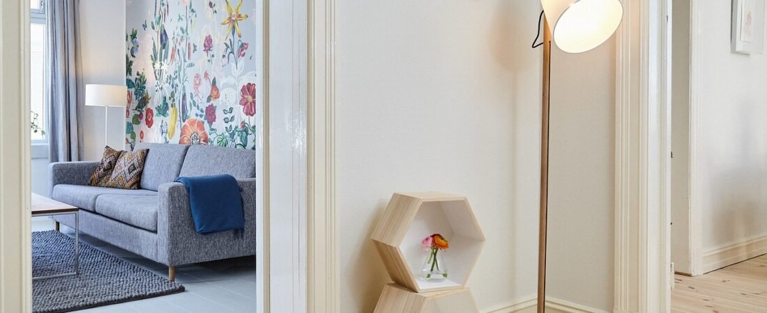
I spent most of August rebuilding my living room Pinterest board from scratch. Out went the round bouclé swivel chair I’d been saving for two years, the perfectly symmetrical gallery wall grid, the all-beige everything. It wasn’t that I’d fallen out of love with any of it exactly — it was that every “2026 living room” search kept surfacing the same handful of looks, and I started to wonder if I’d just been late to a party that was already winding down. Turns out I wasn’t imagining it. Apartment Therapy’s design team recently polled working interior designers about what they’re actively steering clients away from this year, and the answers were surprisingly specific, and surprisingly consistent. Here’s what’s officially on its way out in 2026, straight from the people who redecorate homes for a living, and what they’re reaching for instead.
The Giant Round Bouclé Chair
If one silhouette defined the last few years of “cozy modern” interiors, it was the oversized, cloud-like bouclé chair — round, textural, endlessly photogenic. Designers say it has officially peaked. “The giant round cloud chair that looks incredibly photogenic and is genuinely uncomfortable to sit in for more than 12 minutes has run its course,” says Janelle Patton of Lark Interiors, speaking to Apartment Therapy. The critique isn’t really about the fabric or the curve — it’s that the shape stopped being a design choice and became a prop. Designers are steering clients toward pieces that photograph well but are still genuinely built for sitting, reading, and actually living in.
All-Beige, Tone-on-Tone Everything
The neutral, “quiet luxury” wash of camel, cream, and taupe that dominated so many living rooms is losing its grip, and two different designers independently called it out to Apartment Therapy. “We are ready to retire the RH aesthetic: all beige everything,” says designer Ashley Ferguson. Kanika Bakshi Khurana of Kanika Design put it more bluntly, describing the feeling of an all-neutral room as “an emotional flatline.” Neither designer is arguing against neutrals as a base — the pushback is against rooms with zero contrast, zero color, and zero personality layered on top. The fix designers are recommending is simple: keep the calm foundation, then add one or two colors or materials that actually mean something to the people living there.
Matching Wood Tones
The instinct to buy a “matching set” — same stain, same finish, same wood species across every piece of furniture in a room — is falling out of favor with professionals. Burcu Ercetin of Design & Curations told Apartment Therapy that “mixing tones, such as walnut and oak, creates depth, and feels much more natural and layered.” It’s a small shift, but it changes how a room reads: a mix of warm and cool wood tones looks collected over time rather than shopped in a single afternoon, which is exactly the point. This one is genuinely easy to test at home — before replacing anything, try pulling in just one piece in a different wood tone than the rest of the room and see how much more dimension it adds.
The Perfectly Symmetrical Gallery Wall
The gridded gallery wall — same-size frames, evenly spaced, perfectly aligned — is another casualty. “It reads more like a checklist than a choice,” Janelle Patton told Apartment Therapy of the trend. The complaint tracks with a broader shift designers describe toward rooms that feel curated by a person rather than assembled from a template. An asymmetrical arrangement of mismatched frame sizes and finishes, hung with a little breathing room between pieces, is what designers are pointing clients toward instead — it takes more trial and error to get right, but it also can’t be copy-pasted from someone else’s living room.
Hiding the TV At All Costs
For years, the unspoken rule of a “designed” living room was that the television had to be disguised, tucked into a cabinet, or hidden behind art. Designers are dropping that rule entirely. “I am ready to retire the notion that a TV can’t be above a fireplace or that it’s taboo,” Ashley Ferguson told Apartment Therapy. It’s a practical shift as much as an aesthetic one: hiding a TV usually means compromising on viewing angle, sound, or cabinetry budget, and designers increasingly see the effort as disproportionate to the payoff. A well-proportioned television, mounted cleanly and framed by good furniture and lighting around it, no longer reads as a design failure.
Curves for Curves’ Sake
Curved sofas, arched doorways, and rounded furniture legs defined the last design cycle so thoroughly that designers now say the pendulum has swung too far. “A little goes a long way. When everything is curved, it starts to feel like too much,” designer Terri Brien told Apartment Therapy. The note here is important: designers aren’t rejecting curves altogether, they’re rejecting rooms where every single object — sofa, mirror, table, lamp — repeats the same rounded shape. The more current approach treats a curve as one accent among straight lines and angles, rather than the organizing principle of an entire room.
Beige Zellige Tile in Every Kitchen
Handmade zellige tile earned its popularity honestly — the slight irregularity and glassy glaze genuinely elevate a backsplash or bathroom wall. But its sheer ubiquity, especially in the same soft beige and cream colorways, is what’s pushing designers away from it now. “When something shows up that consistently, it starts to lose what made it special,” Terri Brien told Apartment Therapy. The material itself isn’t the problem; the monoculture of it is. Designers say the same handcrafted, slightly imperfect texture reads as fresh again the moment it shows up in an unexpected color, a bolder pattern, or a less-expected room entirely, like a powder bath or a fireplace surround.
A Full Industrial Influence
Exposed brick, black metal fixtures, and cold gray palettes had a long run as the default “urban loft” look, but designers say it’s aging fast. “The industrial fixtures that support the gray rooms are starting to look a bit tired,” says Alexis Pew of Kaminki + Pew. The shift away from industrial tracks with the broader move toward warmth this year — softer materials, layered lighting, and furnishings that feel handled rather than fabricated. A single black metal light fixture or a piece of reclaimed wood can still work beautifully; it’s the wall-to-wall, gray-and-black uniform that designers are asking clients to soften.
Overdone Fluted Millwork
Ribbed and fluted paneling has covered nearly everything in the last two years — kitchen islands, bathroom vanities, entire accent walls. Designer Kellie Reynolds of Smith Reynolds Interiors told Apartment Therapy, “I think fluted millwork has been overdone and doesn’t feel as timeless.” Her advice is to use it the way it was originally meant to be used: as a single, deliberate architectural moment, like one island face or a fireplace surround, rather than a texture applied to every vertical surface in a home. Used sparingly, it still reads as intentional; used everywhere, it starts to look like a kit.
What This Actually Means for Your Home
None of this is a mandate to rip out a chair you love or repaint a kitchen you just finished. What’s genuinely useful about this batch of designer feedback is the pattern underneath it: almost every “retired” trend on this list started as a single good idea — a curve, a neutral palette, a matching finish, a symmetrical grid — that got flattened into a formula once it went viral. The trends replacing them aren’t new shapes or colors so much as they’re a return to editing: one curve instead of five, one accent color instead of none, mismatched wood and frames instead of matching sets. If your living room already leans toward variety over uniformity, you’re probably in better shape than you think. If it doesn’t, the cheapest fix isn’t new furniture — it’s simply resisting the urge to make everything in the room match.