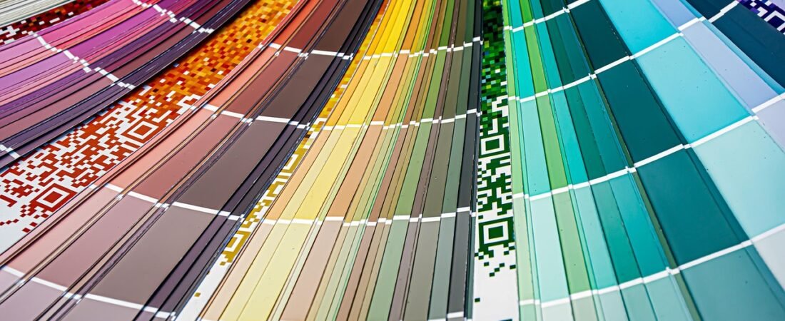
I was standing in the paint aisle last week, phone in hand, comparing a chip labeled “Celery” to one labeled “Grounded,” and it took me a full minute to realize they were from two different companies. That mix-up is the story of this fall’s biggest decor news: within a few weeks of each other, Sherwin-Williams and Behr, the two brands homeowners actually walk into a store to buy, both named a green as their 2027 Color of the Year. Not a similar green. Not a green among several options. The single, headline color, the one each brand builds an entire year of marketing and paint chip displays around, landed on the same family of hue at both companies, independently, on the same news cycle.
Two Rivals, One Color Instinct
Sherwin-Williams called its pick Celery, a warm, herbal green with just enough yellow in it to read as fresh rather than mossy. Ashley Banbury, color marketing manager for Sherwin-Williams, explained the thinking behind it directly: “I really see in 2027 colors becoming warmer and a lot more fresh and uplifting. We want to come into a space that makes us feel great.” She went further on why this particular shade made the cut, saying Celery “was chosen as the 2027 Color of the Year because it reflects today’s priorities: wellness, balance, and connection.” (Hunker)
Behr went darker and earthier with Grounded, a deep olive that leans more toward moss and forest floor than herb garden. Kayla Kratz, Behr’s head of color, described the balance inside the formula itself: “Moss really brings the vitality to the color, while olive brings the warmth. It’s not overly botanical or dark. It feels like that subtle breath of cool air when you’re under a tree canopy.” She tied the color to something bigger than a paint swatch, too: “It’s really rooted in renewal. It’s a color that brings tactility to a space.” (Apartment Therapy)
Even Dutch Boy, a smaller but still widely stocked brand, landed in the same emotional neighborhood with Deep Rooted, a bold terracotta with dark, almost burnt undertones. It is not green, but it shares the same instinct: a color pulled straight out of the ground rather than off a screen. The Behr design team put words to that instinct plainly, describing Grounded as designed to help homeowners “transition from the day’s high-energy buzz into a more rhythmic, calming state,” inspired by “earth’s exhale, that quiet moment when the sun dips below the treeline.” (Livingetc)
It Is Not Really About Green, It Is About What Green Is Replacing
Color of the Year picks are marketing, obviously, but they are also one of the more honest snapshots of where an entire industry thinks the culture is heading a year out, because paint companies have to commit to a shade, a name, and a national campaign long before regular homeowners ever see it on a wall. So it matters that two competing giants, working with different research teams and different focus groups, both walked away from the same conclusion at the same time: that people are tired of screens, tired of speed, and hungry for something that reads as slow and organic instead.
You can hear that same theme when Anna Miller, director of trend and design at The Home Depot, talks about how homeowners are actually going to use Grounded. She described it working equally well indoors and out, noting the brand has “seen the farmhouse aesthetic, white with dark windows,” and that bringing Grounded in “can either be the contrast, like paint your windows, the sash, the frame, that color. Or it’s all over, like the siding, and then it blends with the landscape beautifully.” She summed up the appeal in one line: “We’ve just loved the exciting interplay of cool and warm going on.” (Apartment Therapy)
How Designers Say to Actually Use These Colors
Neither Sherwin-Williams nor Behr is suggesting anyone paint an entire house green from floor to ceiling, and the quotes from their own color teams make that clear. Banbury pointed specifically to kitchen cabinetry as the most successful place she has seen Celery applied, saying, “What I really love about this color is when it’s on kitchen cabinets. It’s very fresh and feels unexpected.” That is a meaningfully different pitch than a whole-room repaint: a single run of lower cabinets, an island, or a pantry door is a contained enough project that you can test the color without redoing your whole kitchen.
Kratz made a similar case for Grounded by talking about what it pairs with rather than what it replaces. “It’s still introducing color to the space, but it’s a specific nuance of green that plays really well with different wood tones,” she said. “And with metals, gold and brass brings out the warmth, while you can use chrome to make a modern interpretation of the color.” In practice, that means the easiest entry point is not a wall at all. It is a piece of furniture, a door, or a built-in bookcase that already sits near warm wood or brass hardware, where the green reads as an intentional pairing instead of an isolated accent.
What This Means If You Are Not Ready to Repaint Anything
If a full repaint is not on your radar this fall, the more useful takeaway from these announcements is not the exact paint code, it is the direction. Both companies are signaling that the muted, warm-neutral phase that has dominated the last few years is giving ground to color again, and specifically to colors that look like they came from outside rather than from a design software palette. That shows up long before anyone repaints a wall: in a moss-green ceramic vase on a shelf, a terracotta throw pillow that echoes Dutch Boy’s pick, or a set of olive linen napkins on the table.

It is also worth noticing what these picks are not. Neither Celery nor Grounded is a trend color in the sense of something loud or trendy-looking, the way past picks have leaned into brighter, more Instagram-ready shades. Both brands are explicitly describing these greens as calming, restorative, almost medicinal in tone, which tracks with a broader pattern this year of homeowners wanting rooms that feel like a break from their phones rather than a backdrop for them. If you have been holding off on adding any color to a room that has stayed safely neutral for years, this is about as low-risk a signal as the paint industry sends: two competitors agreeing, independently, that green is where people want to land next.
I ended up buying neither sample that day in the aisle. I took photos of both chips instead and taped them to the inside of my kitchen cabinet, where I glance at them every morning while the coffee brews. Somewhere around the second week, Grounded started to look less like a paint name and more like a description of how I wanted the room to feel. That is probably the whole point of naming a color of the year in the first place.