
Last weekend I taped five paint swatches to my hallway wall, and four of them were red. Not fire-engine red, and not the pumpkin-adjacent orange that shows up in every fall display at the hardware store. These were the muddy, brownish, almost wine-cellar reds that looked wrong on a white card and strangely perfect once they sat next to the oak floor. I did not set out to follow a trend, and I certainly did not expect to spend an evening arguing with myself over the difference between maroon and oxblood. Then I started reading what designers are saying this season, and it turns out my hallway wall was keeping up with the conversation. I also pulled together a few small, low-risk buys for trying the color before you commit a gallon, and since a couple of them are shopping links, I should say that as an Amazon Associate, I earn from qualifying purchases if you click through and buy.
Why Red Is Getting Deeper This Fall
Homes & Gardens published its fall color roundup on August 27, 2026, and the opening theme is easy to spot: designers are leaning into depth, personality and color treated as architecture rather than a temporary accent. Red shows up three separate times in the list of ten, as maroon, oxblood and tomato red, and a dusky, mud-red mauve makes four. Brown and bottle green sit right beside them.
A week later, OROA’s fall color guide, published September 2, went further and called burgundy, merlot and oxblood “the new deep neutral” for the season. That is a retailer talking, so I treat it as a market signal rather than gospel. But it matches what the designers say, and it matches the logic of the last two years: after the chocolate brown wave, the eye is ready for a color that is just as warm and a little more expressive.
Inman’s September 11 fall trends piece, written for real estate agents, lands in the same place. In its section on jewel-toned maximalism, it says “burgundy, oxblood, plum, mustard, chocolate and navy are the star hues of the trend.”
Maroon, Oxblood and Burgundy: What Is the Difference?
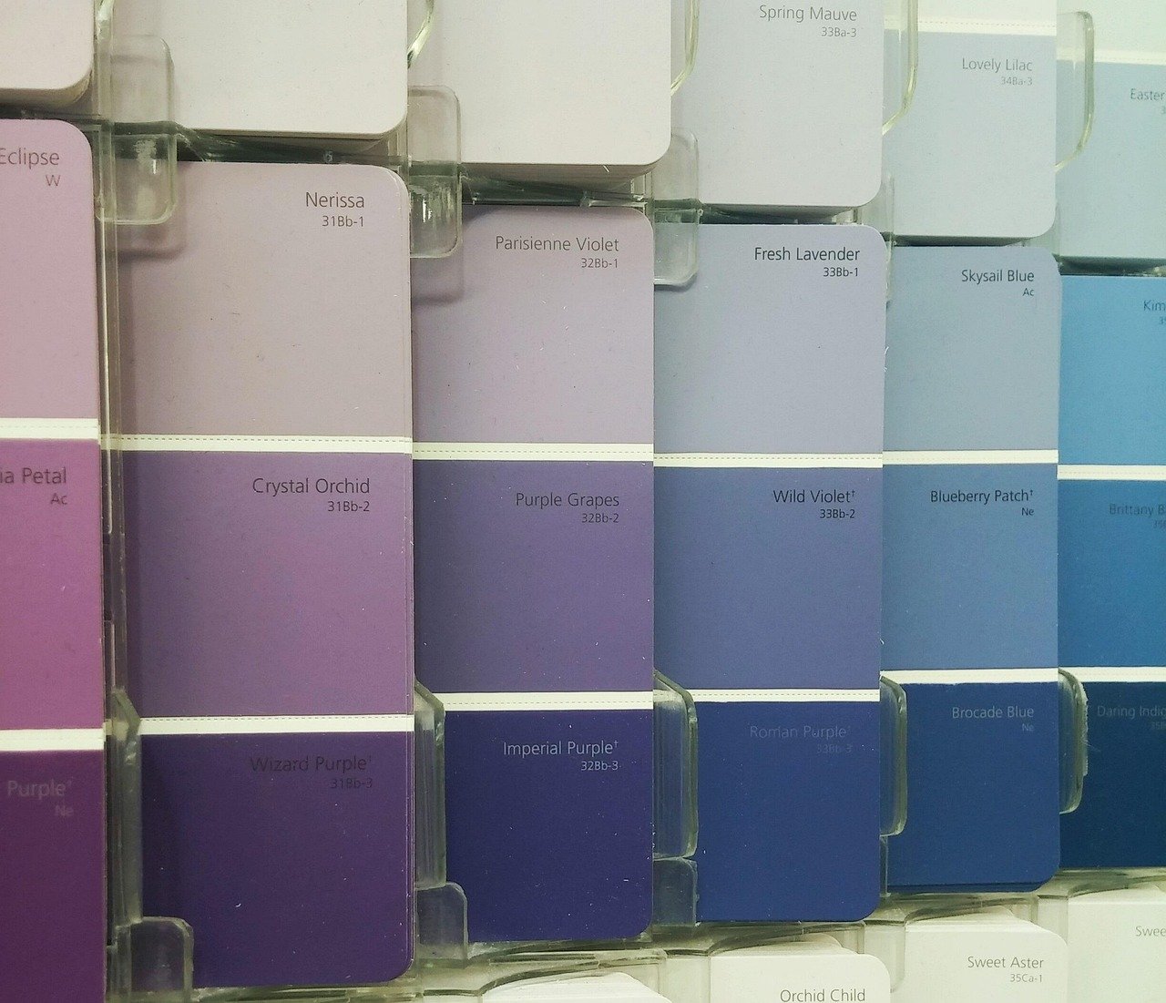
The names get used loosely, and the paint chip aisle does not help. Homes & Gardens draws a useful line: maroon sits between classic burgundy and warm brown, while oxblood moves further into brownish-burgundy territory. Burgundy itself tends to read a little purple. Merlot and plum lean cooler still.
Why it matters: the more brown in the red, the more it behaves like a neutral. Oxblood and maroon sit comfortably beside walnut, leather and tobacco tones. A true burgundy or plum can feel a bit more formal and works best with brass and cream. Hold every sample up to your actual flooring and your actual evening light before you pick one.
Start Small: Velvet, Mohair and One Good Chair
If you are nervous, do not paint anything yet. OROA makes a point I agree with: material changes how a deep red reads. Velvet intensifies the depth, leather develops patina, and a single substantial burgundy chair has more impact than a scatter of tiny accessories. In other words, one confident piece beats ten timid ones.
For a first test, swap two throw pillow covers on a neutral sofa for something dark and rich. The point is to see how the color behaves in your own light for a few weeks. These are cheap enough to return to the closet in spring if you change your mind: burgundy velvet pillow covers.
Texture is the second lever. Designers Mallory Robins and Elizabeth Bennett of KOBEL + CO recommend layering mohair, wool and lacquered finishes in neighboring tones when you work with oxblood. A chunky throw over the arm of a chair gets you most of that effect for very little money: a wool or mohair-blend throw in a wine shade.
Go Bigger: Cabinets, Built-Ins and Woodwork
This is where the trend gets serious. Michelle Gage, a Philadelphia-based designer, told Homes & Gardens, “Maroon is really having a moment right now. We love its deep, rich hue and unexpected intensity.” The magazine suggests putting it on cabinetry, built-ins or woodwork and pairing it with creams and soft neutrals so the color can breathe.
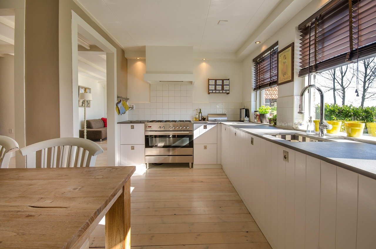
Kitchens are the clearest example. In a Homes & Gardens cabinet color story from February 2026, designer Mary Beth Sullivan of MB Sullivan Design said, “I am anticipating plum and oxblood to take center stage in kitchens this year.” She adds that these gemstone colors pair well with unlacquered brass, polished nickel, marble, warm woods and a natural fiber such as linen. The same story points to a Studio Duggan kitchen with deep red cabinets against pale pink walls, which proves dark cabinets do not have to make a dark kitchen.
Domino’s designer survey from December 2025 shows the idea was already building. Drew Michael Scott of Lone Fox said, “I just painted a room Sommelier by Sherwin-Williams and think it would look amazing on kitchen cabinets.” If you are not ready to repaint a whole kitchen, hardware is the cheapest way to nod at that warm-metal pairing: unlacquered brass cabinet pulls age naturally, which suits a deep red backdrop.
Drench a Small Room
Oxblood is not only for cabinets. The KOBEL + CO designers say it is particularly effective in smaller rooms, where a dark palette becomes a feature instead of a problem. Their advice, as reported by Homes & Gardens, is to commit by carrying the color across walls, trim, cabinetry and ceiling. For a lighter touch, use it through upholstery, textiles or accessories. In their words, “Oxblood is moody and enveloping yet retains a sense of warmth.”
A powder room, a home office or a reading nook is the obvious candidate. These are rooms you pass through or sit in for a limited time, so a strong color feels like an event, not a lifestyle. Lighting matters here. Deep reds go flat under cool white bulbs, so warm lamplight does a lot of the work. A ceramic lamp in a coordinating tone gives you a glowing pool of color after dark: a deep red ceramic table lamp.
Ruth Mottershead, creative director at Little Greene, makes a similar case for dusky mauve, a softer cousin of the same family: “It has real depth and warmth, almost a mud-red undertone. This makes it feel grown-up and enveloping rather than sweet.” Her tip for any enveloping shade is to continue it across all four walls and the ceiling so the room feels larger and more restful.
What to Pair With Maroon and Oxblood
The designers quoted this season agree on a short list of companions: warm woods, creams, natural stone, aged or unlacquered brass and natural fibers. Here is how that breaks down in practice.
- Cream and linen. Soft neutrals give the red room to breathe, as Gage suggests. Oatmeal or ivory curtains are an easy place to start: oatmeal linen curtains.
- Walnut and warm wood. Dark wood and deep red share the same brown undertone, which is why they feel settled together.
- Aged metals. Antique or unlacquered brass warms the whole scheme and gets better with age.
- Bottle green. Andrea Goldman, a Chicago-based designer, says “Deep green can create a wonderful sense of grounding when paired with natural materials and quieter textures.” A red and green pairing used to mean Christmas, so keep both muted and let wood and stone do the talking.

How to Keep It From Looking Like a Fall Display
The one real risk with this trend is that it reads as seasonal decor, as in pumpkins and plaid, instead of a lasting color choice. OROA’s guide puts it well: “Context is everything. Pair burgundy with predictable orange and tan and it immediately becomes autumnal. Pair it with walnut, ivory, marble, antique brass or muted blue and it takes on a much more enduring character.”
That is the test I am now using on my own swatches. If a red only makes sense next to a pumpkin, it is a decoration. If it still looks right in April next to a stack of ivory linens and a walnut table, it is a color.
Where I Landed on My Hallway
After a week of looking, I eliminated the two brightest swatches and kept the two with the most brown in them, which in Homes & Gardens terms means one maroon and one oxblood. My plan is to test the oxblood on a single wall behind the bench, with warm bulbs overhead and the oak floor untouched, before I even think about carrying it onto the trim. If you are standing in front of your own wall, the advice that holds across every source above is the same: pick the red with the most brown, add warm light and natural materials, and live with a sample for at least a week before you buy the gallon.