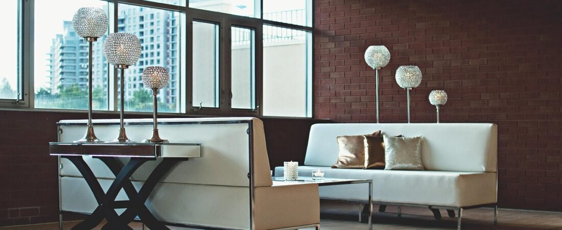
When Priya Chandran signed the lease on her 540-square-foot studio in a converted warehouse outside Chicago, she budgeted three months to make it feel like a real home instead of a place to store her things while she lived somewhere else, mentally. She’d rented small before — a boxy one-bedroom in her twenties, furnished mostly with whatever survived a few moves — and she remembered that apartment as cramped, beige, and forgettable. This time she wanted the opposite: a space that read as chosen, not endured. What she didn’t expect was how fast it happened once she stopped thinking about her studio as a compromise and started designing it like a space with its own logic. That shift is exactly what’s driving small-space design in 2026. The trends aren’t about hiding a lack of square footage anymore — they’re about making a small footprint the whole point.
Mirrors Are Doing More Than Reflecting Light
Mirrors in small rooms used to mean one modest piece hung over a console, mostly out of habit. That’s changed. Designers are now using large-scale, often floor-length mirrors as a structural design move, not an afterthought. “For smaller rooms, we’re seeing a resurgence of reflective surfaces to open the space up and trick the room into feeling twice as large,” says Sarah Goesling, owner and principal of the Goesling Group, in an interview with Homes & Gardens. The key word is trick — a mirror placed to catch a window or a light fixture does real work, doubling daylight and sightlines in a way that a coat of paint alone can’t. In 2026, that means mirrors leaning against a wall like art, mirrored cabinet fronts in a kitchenette, or a mirrored backsplash behind open shelving, all treated as finished design elements rather than practical patches.
Furniture That Refuses to Have Just One Job
Multifunctional furniture has existed for years, but the 2026 version looks noticeably better than the fold-out futons and flat-pack storage ottomans that defined the category a decade ago. Think daybeds with hidden drawers finished in the same upholstery as the cushions, dining tables that expand from a two-person console to a six-seat surface without exposing raw hardware, and coffee tables that lift, split, or nest without looking like a gadget. The goal isn’t just saving space — it’s saving space without the room looking like it’s apologizing for it. A piece that does two jobs well now gets chosen for how it looks doing either one, not just for what it can hide.
Vertical Storage as a Design Statement
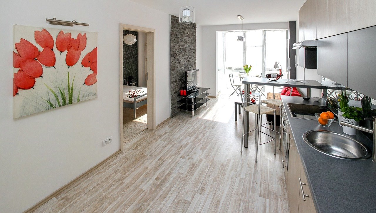
The instinct to build up instead of out isn’t new, but in 2026 vertical storage has stopped being purely functional and started being decorative. Instead of a plain white bookcase pushed against a wall, designers are specifying floor-to-ceiling millwork with distinct proportions — open cubbies mixed with closed cabinetry, a band of color or wood grain that draws the eye upward, integrated lighting tucked under shelves. Brian Woulfe, founder of Designed by Woulfe, told Homes & Gardens that this year is about “a continued move towards making smaller spaces more thoughtful, with considered design choices enhancing the home’s footprint,” adding that the goal is “leaning away from overly-filled rooms and towards edited schemes that make the space feel generous.” Applied to storage, that means shelving units built to the exact height of the ceiling, closet systems with visible brass or matte black hardware instead of hidden tracks, and vertical stacks that are curated rather than crammed — a handful of well-chosen objects with room to breathe, instead of every surface pressed into service.
Bold Color, Used With Confidence
For a long time, the standard small-space advice was to keep walls light and neutral so the room wouldn’t feel boxed in. That guidance is being quietly abandoned. “Color drenching is definitely a trend that we know well and love…especially in smaller spaces,” says Meeshie Fahmy, founder of Haus of Meeshie, noting that the ceiling shouldn’t be left out of the treatment. Drenching a small room — walls, trim, and ceiling in one saturated tone — removes the visual stopping points that make a room feel chopped up, and it reads as deliberate in a way a single accent wall never quite does. The trend favors deep, warm tones over the palest pastels: terracotta, ink blue, olive, aubergine. In a small room, that kind of commitment tends to feel more expensive than a cautious neutral ever did, because it signals a decision rather than a hedge.
Layering Texture Instead of Adding More Stuff
Small rooms have a low ceiling on how many objects they can hold before they start to feel cluttered, so the 2026 approach leans on texture to do the work that extra decor used to do. A wool throw, a linen slipcover, a plaster-finish wall, a rattan pendant, a wood coffee table with real grain — layered together, they create depth and warmth without adding visual noise. This lines up with what several designers have been telling Apartment Therapy about small living rooms lately: restraint on quantity, generosity on quality. Jessica Ahnert Davis, owner and creative director of Atelier Davis, put it plainly when discussing small-room styling: a single, well-chosen layered element reads as considered, while stacking too many similar textures — several rugs, several throws, several patterns competing at once — can, in her words, chop up a room instead of grounding it. The fix isn’t fewer textures. It’s fewer categories of texture, each one doing real work.
Zoning a Studio Without a Single Wall
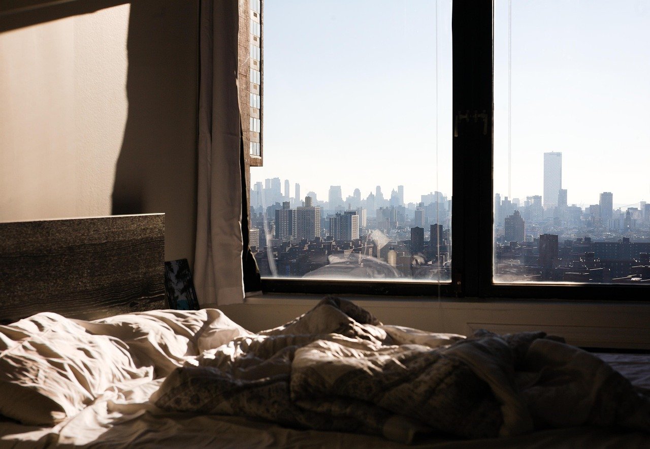
Studio living means the bed, the desk, and the dinner table are all technically in the same room, and 2026’s answer to that isn’t a room divider screen from a decade ago — it’s zoning through materials and light instead of structure. A change in flooring, like a jute rug that stops exactly where the sleeping area begins, can mark a boundary as clearly as a wall would. So can a shift in lighting temperature: a warmer, lower pendant over the bed and a brighter task lamp over the desk train the eye to read them as separate spaces, even without a physical divide. Open shelving units placed perpendicular to a wall, rather than flush against it, can quietly split a studio into a living zone and a sleeping zone while still letting light travel the full length of the room. None of this requires construction, a landlord’s permission, or losing the openness that made a studio appealing in the first place — it just requires treating each zone as its own small room with its own materials, instead of one long undifferentiated stretch of floor.
One Statement Piece, Correctly Scaled
It’s tempting to assume a small room needs small furniture, but several designers are pushing back on that logic. Jennifer Beget, owner and principal designer of J Beget Designs, has made the case to Apartment Therapy that undersized furniture can actually make a room read as smaller, not larger, because tiny pieces leave awkward gaps of empty floor that the eye has nowhere to rest on. The fix in 2026 is one generously scaled piece — a substantial sofa, an oversized pendant, a single wide-armed chair — anchoring the room, paired with everything else kept lean. Purvi Padia, founder of House of REVELRY, makes a similar case for lighting specifically: a small space, she has said, can absolutely house a statement fixture, as long as it’s balanced with one or two smaller, lower light sources at different heights so the eye has multiple places to land instead of just one dramatic focal point. The through-line is scale used with intention — one confident piece, not a room full of cautious, matching ones.
What ties all of this together is a shift away from small-space design as damage control. A studio in 2026 isn’t being dressed to distract from its size — it’s being designed the way any well-considered room would be, with materials, color, and scale chosen on purpose. Priya’s 540 square feet never got bigger. It just stopped looking like it was waiting to be.