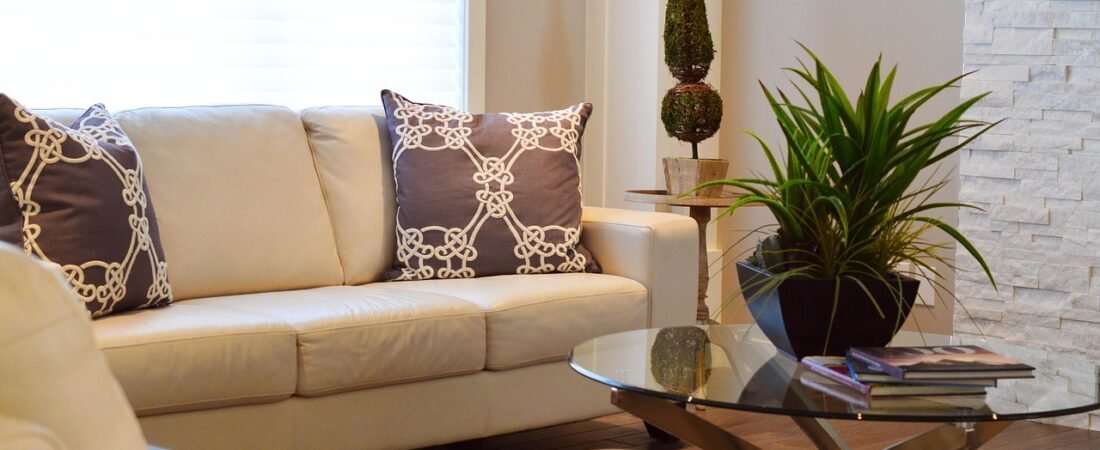
Two weekends ago I stood in my sister’s dining room holding a paint swatch fan, trying to talk her out of what I was sure was a mistake. She wanted to paint the walls, trim, and ceiling the exact same shade of deep, bitter-chocolate brown, no accent wall, no break for the crown molding. I kept saying it would feel like a cave. Then she finished the room, turned on the pendant light over the table, and I had to admit I was wrong — it felt less like a cave and more like the inside of a really good wine bar. A week later I found out she wasn’t just following a hunch; she was following a documented, fast-growing trend among actual interior designers. A few of the pieces below are ones I’ve since bookmarked for my own place, and as an Amazon Associate, I earn from qualifying purchases if you shop through those links.
The Survey Behind the Comeback
This isn’t a trend I’m pulling out of thin air. The resale platform 1stDibs runs an annual survey of hundreds of working interior designers about what they’re actually specifying for clients, and the 2026 results, based on nearly 470 designers surveyed, found that chocolate brown was selected by 33% of respondents as a top color choice for the year — nearly double the 17% who said the same back in 2022. That’s not a niche aesthetic bubbling up on one corner of the internet; that’s a third of professional designers independently landing on the same hue.
Sophie Salata, Head of Brand at the vintage furniture platform Vinterior, put her finger on why brown keeps winning over other neutrals. “Brown works because it anchors a room,” she said. “It brings instant depth without demanding attention.” She’s also noticed it in what people are actually shopping for: “At Vinterior, we’re seeing shoppers gravitate towards those rich tobacco leathers, warm walnut woods, and deep chocolate textiles.”

Why Brown, and Why Now
Part of the appeal is timing. Brown has been edging back into fashion for a few years — Pantone’s 2025 color of the year was a warm mocha — but designers say 2026 is when it stopped being a tentative accent and became something people are willing to commit an entire room to. Liz Hoekzema of KLH Homes told House Digest her studio reaches for it specifically because of how it behaves next to other colors: “Our studio loves to incorporate the warmth of brown for how well it contrasts with other colors. It also just feels inherently grounded.”
Jacu Strauss, designer and creative director of Lore Group, frames the whole look as a more grown-up riff on a decade that gets a bad reputation. “I’m very excited about a return to 70s glamour, but a curated, sophisticated version of it,” he said. “Think expressive upholstery, generous mirrored furniture, and rich browns paired with glass.” That pairing — brown walls, a mirrored or glass surface, a little bit of shine — is the detail that keeps the look from reading as dated 1970s paneling. It reads as intentional instead.
Salata’s read on why people want this right now is less about color theory and more about how a home feels to live in. “People are craving homes that feel lived-in and layered, and brown helps achieve exactly that,” she said. After years of houses that were praised for looking calm and untouched, there’s a real appetite for rooms that look like someone actually exists in them.
What “Color-Drenching” Actually Means
If you’ve seen the term floating around and weren’t sure what it meant, color-drenching is simply painting every surface in a room, walls, trim, ceiling, sometimes even the door, the same color instead of treating the ceiling as “always white” and the trim as “always a contrasting accent.” Dropping that contrast is what makes a dark color feel enveloping instead of heavy — your eye doesn’t hit a hard stop at the ceiling line, so the color reads as atmosphere rather than a block of paint on one wall. It’s the technique behind my sister’s dining room, and it’s the reason a chocolate brown room photographs so much moodier and more intentional than a single brown accent wall ever does.
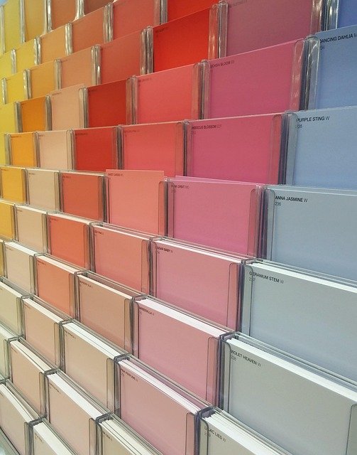
If you’re testing the waters before committing a whole room, a set of large paint sample swatches lets you see how a chocolate brown actually reads in your own light before you buy a gallon, since the same shade can look almost black in a north-facing room and warm and glowing in a south-facing one. Shop large paint sample swatches on Amazon.
Testing the Look Without Painting a Whole Room
Not everyone is ready to drench an entire room, and the designers quoted above aren’t suggesting you have to. The textiles Salata mentioned, tobacco leather, walnut wood, deep chocolate fabric, are the easiest entry point precisely because they’re swappable. A pair of chocolate-brown bouclé or velvet throw pillows on a lighter sofa does a surprising amount of the same visual work as a painted wall, just without the commitment. Shop chocolate brown bouclé throw pillows on Amazon.
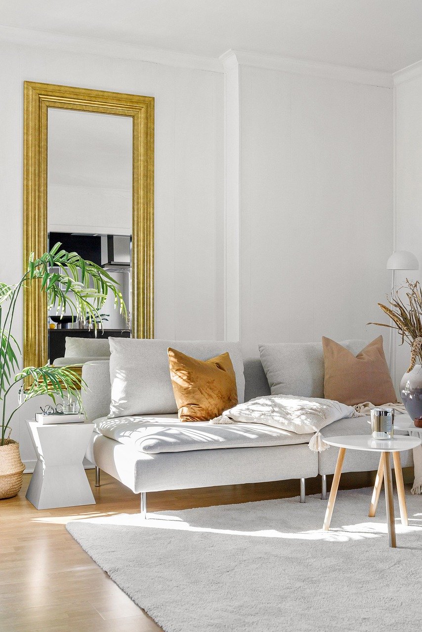
Strauss’s advice to pair rich brown with glass and mirrored surfaces is easy to borrow on a small scale, too. A mirrored or glass-top side table next to a dark leather or brown-upholstered chair gets you that “70s glamour, but curated” effect he described without touching a wall. Shop mirrored glass side tables on Amazon.
Ceramics are another low-commitment way in. A chocolate-glazed or deep umber ceramic vase on a shelf or console reads as intentional styling rather than a color experiment, and it’s one of the cheapest ways to see whether you actually like living with the tone before it goes anywhere near a wall. Shop brown glazed ceramic vases on Amazon.
Where It Tends to Work Best
Based on what the designers describe, chocolate brown earns its keep most in rooms you want to feel cocooning rather than bright and airy: dining rooms used mostly at night, home offices, libraries, powder rooms, and primary bedrooms. It’s a harder sell in a small, north-facing kitchen you’re already fighting to keep from feeling dim, which is part of why Hoekzema stressed pairing it with brighter accent colors rather than using it as the only tone in a room. A deep brown wall with a few warm, bright accents, mustard, cream, a soft orange, keeps the room from tipping into gloom.
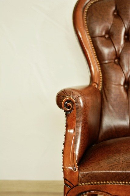
One more detail worth borrowing from Vinterior’s own shopping data: the pieces people are gravitating toward aren’t new and glossy, they’re worn-in. A 1970s coffee table in a moody walnut stain, a vintage leather club chair with some patina, a secondhand wood frame that’s already got a little character. Salata specifically noted that these earthier tones “tend to wear beautifully, they age with grace,” which is a nice way of saying you don’t need to source anything pristine for this look to work. If anything, a slightly imperfect piece suits it better than a brand-new one.
My sister’s dining room has been painted for three weeks now, and the thing that’s stuck with me isn’t the color itself, it’s how differently the room behaves at different times of day. In the morning it looks almost black-coffee dark and a little serious; by the time we sit down for dinner with the pendant light on, it looks warm enough that nobody wants to leave the table. I went into that conversation convinced a monochrome brown room would feel like a mistake, and I left it understanding exactly why a third of professional designers are painting rooms this way on purpose. I haven’t bought the gallon of paint for my own place yet, but the swatch fan hasn’t left my kitchen counter either.